
The Power of Color Accuracy in Ecommerce Product Photography
When I first started shooting for food and beverage brands, I quickly learned something that seems obvious—but is often overlooked: if the colors aren’t right, the entire photo falls flat.
Imagine this: You’re scrolling online and spot a vibrant pack of tropical fruit gummies. The photo shows bold reds, sunny yellows, and juicy purples that practically pop off the screen. But when the package arrives? The colors look faded, the gummies aren’t as bright, and the excitement you felt instantly deflates. That tiny disconnect can turn a happy customer into a hesitant one—and in ecommerce, hesitation often means lost trust and lost sales.
That’s why I care so much about color accuracy in product photography. For CPG brands, color is more than just a detail; it’s the first thing people see.
Why Color Accuracy Matters More Than You Think?
Here’s the truth: people buy with their eyes first. Before they taste your chocolate, sip your cold brew, or open your sauce bottle, they’re judging it by how it looks on a screen.
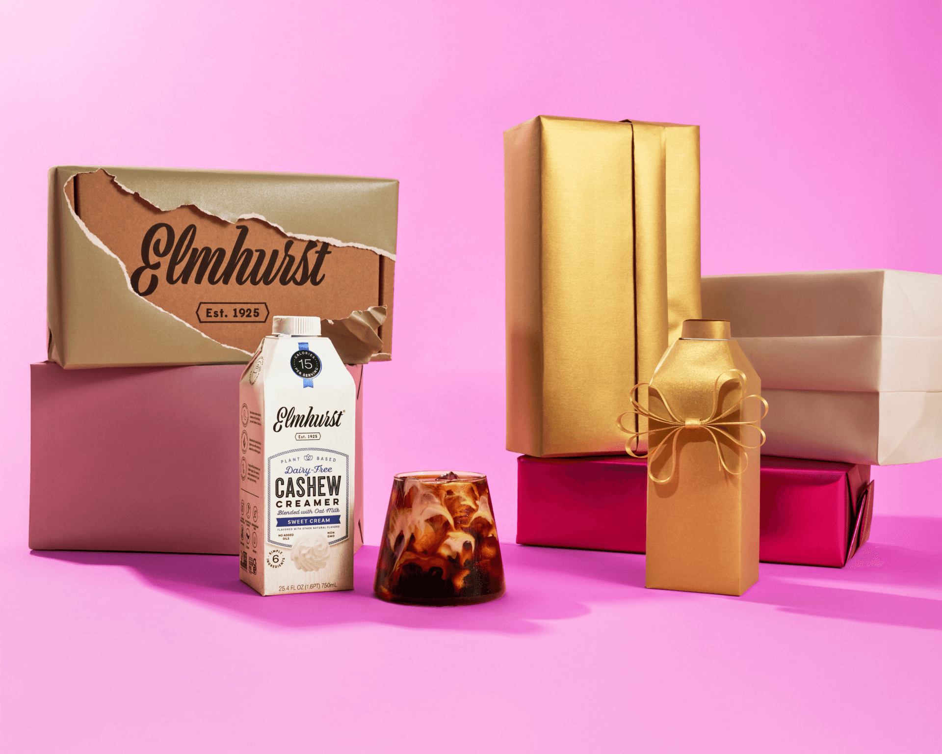
I’ve seen this play out across every collaboration, from the bold black-and-gold branding of Truff hot sauce to the soft, creamy tones of Elmhurst cashew creamer. If Truff’s label came out faded or Elmhurst’s cashew creamer looked more like orange juice than a silky pour, the brand story would be lost before the product even touched the cart.
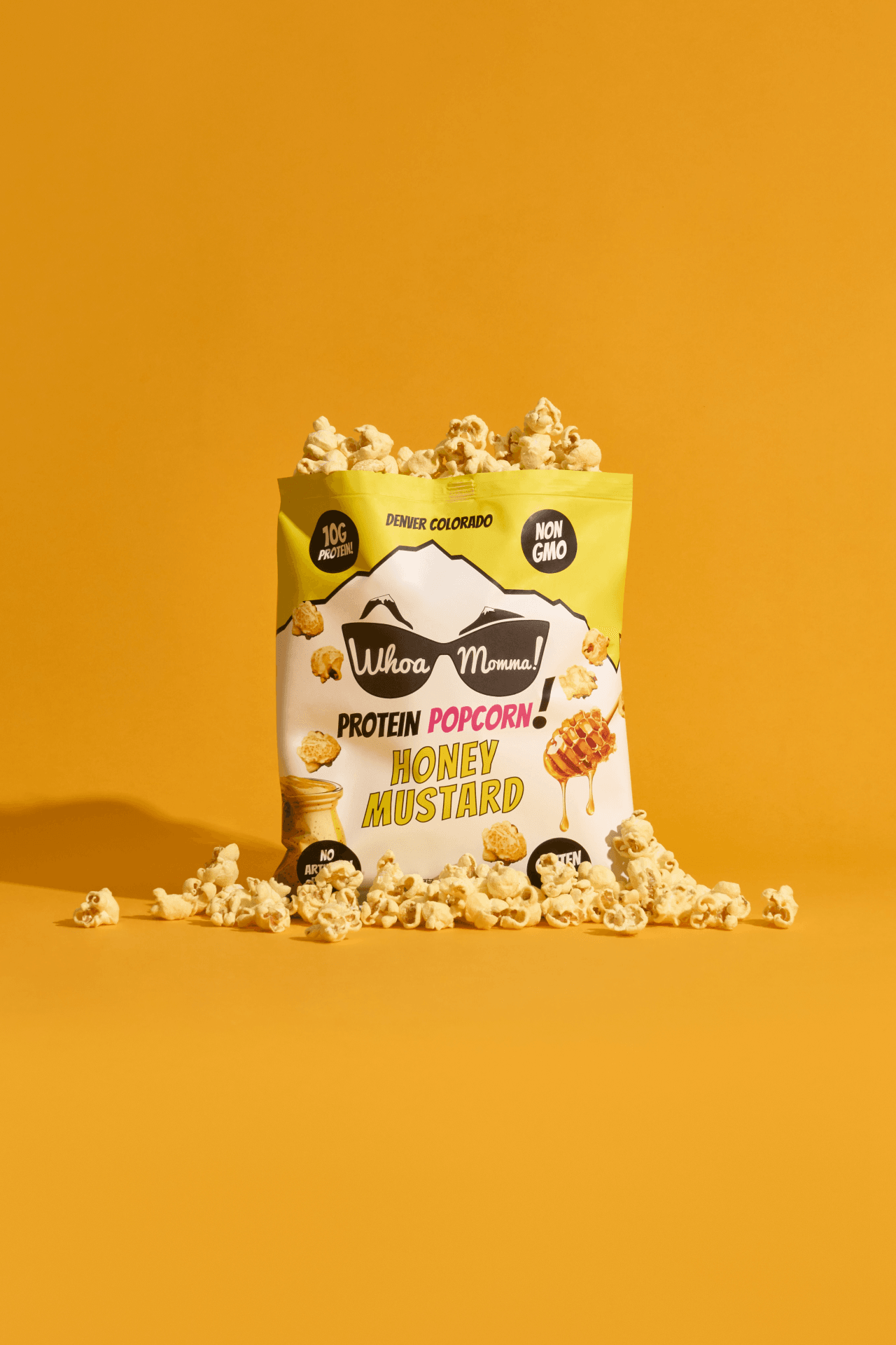
For CPG brands, color isn’t just visual—it’s emotional. A deep green matcha says “authentic and premium.” A ruby-red drink shot says “refreshing and bold.” Get the color wrong, and you’re telling the wrong story.
How We Keep It Real (and Color-Accurate)
At MisaHungry Media, we treat every shoot as the main event, because it truly is. Whether we’re in our studio or on location, we make sure color accuracy is part of every step.
Here’s how:
Lighting that loves your product.
Lighting can make your product look its best or its worst. We set up our lighting to show true colors, avoiding strange shadows or odd undertones.
Editing with restraint.
We’re skilled at photo editing, but we focus on enhancing rather than changing your product. It should look just as good in person as it does online.
Cross-screen checks.
What looks great on a giant monitor doesn’t always translate to a phone scroll at 11 PM. We test across devices so your visuals stay consistent.
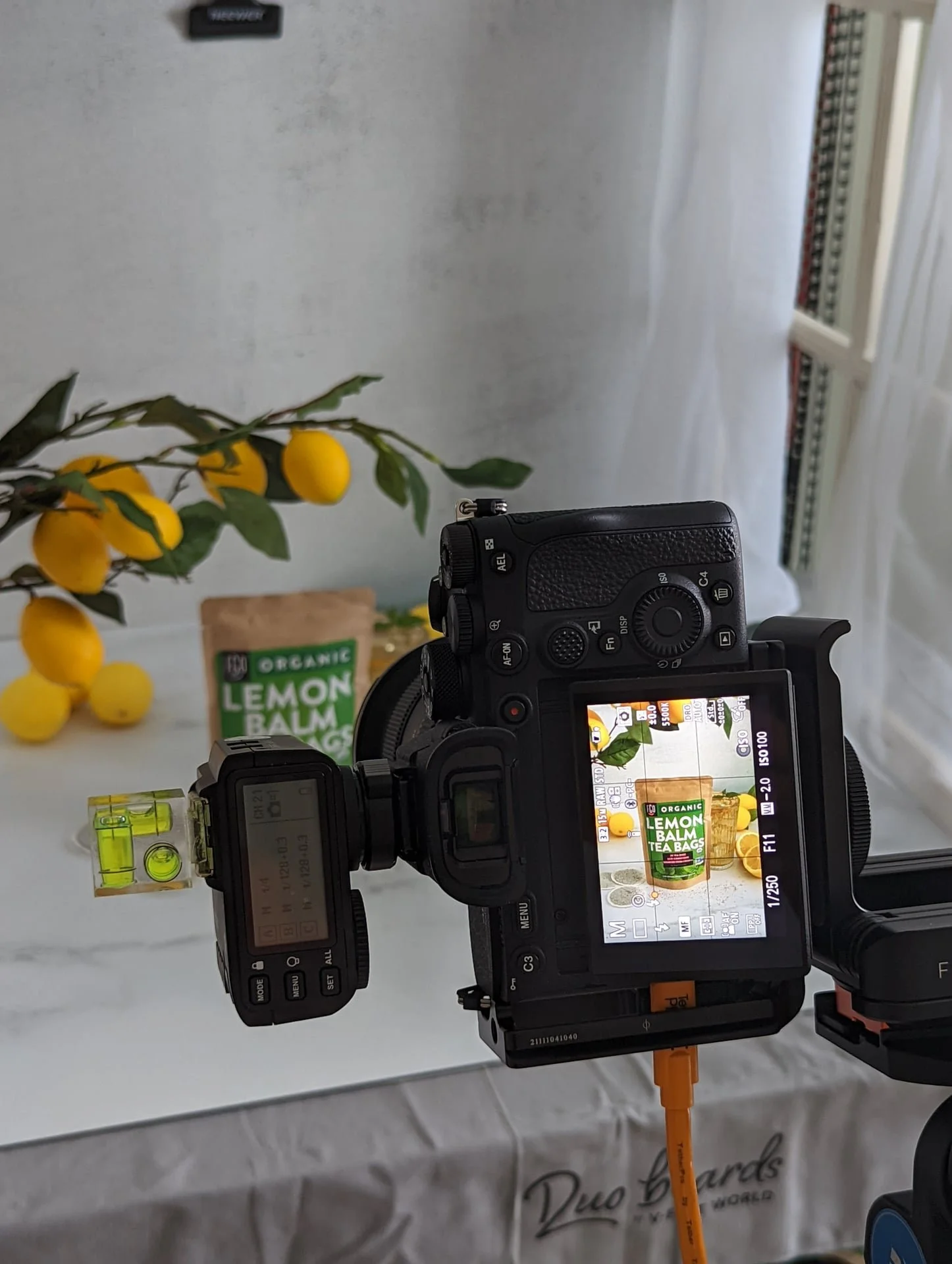
A color checker card at every shoot.
We use a professional color checker card to calibrate the camera and editing process. That means the bold reds, crisp greens, or deep blues of your product stay consistent from studio to screen—no guessing, no dull surprises.
The Real Impact on Ecommerce
Here’s where the magic happens: color accuracy doesn’t just look good—it changes outcomes.
Fewer returns. When products look exactly as promised, customers aren’t disappointed.
Higher conversions. Shoppers click “buy” with confidence.
Stronger branding. Consistency across campaigns reinforces your brand identity.
Think about SkinnyDipped. Their snacks aren’t just delicious—they’re playful, colorful, and vibrant. Our job was to capture that energy in every shot, making sure each almond looked as fun as the brand feels. That vibrancy translated directly into ads that converted.
Your Colors, Your Story
Color is storytelling. It is mood, identity, and appetite all in one. And it’s one of the reasons I love what I do—I get to take a brand’s vision and make it visible (and crave-worthy).
Whether you’re launching a new beverage line, refreshing your ecommerce visuals, or dreaming up a full campaign, don’t underestimate the power of a color-accurate product shoot. Your product deserves to be seen the way it was meant to be enjoyed.
For some extra inspiration, take a look at this blog about the psychology of color in marketing.
Color Accuracy Isn’t Optional
At the end of the day, color accuracy in product photography is more than just a technical step; it’s a promise your brand makes. It means your customer sees online what they’ll actually get at their door.
And honestly? That kind of trust is priceless.
At MisaHungry Media, we’re here to make your products look as tempting as they taste. With styled food photography, bright drink photos, or playful stop motion video, we have the tools and the eye to bring your brand’s story to life.
Because when your colors are true, your customers will be too.