CPG Brand Photography: How to Build a Consistent Visual Identity
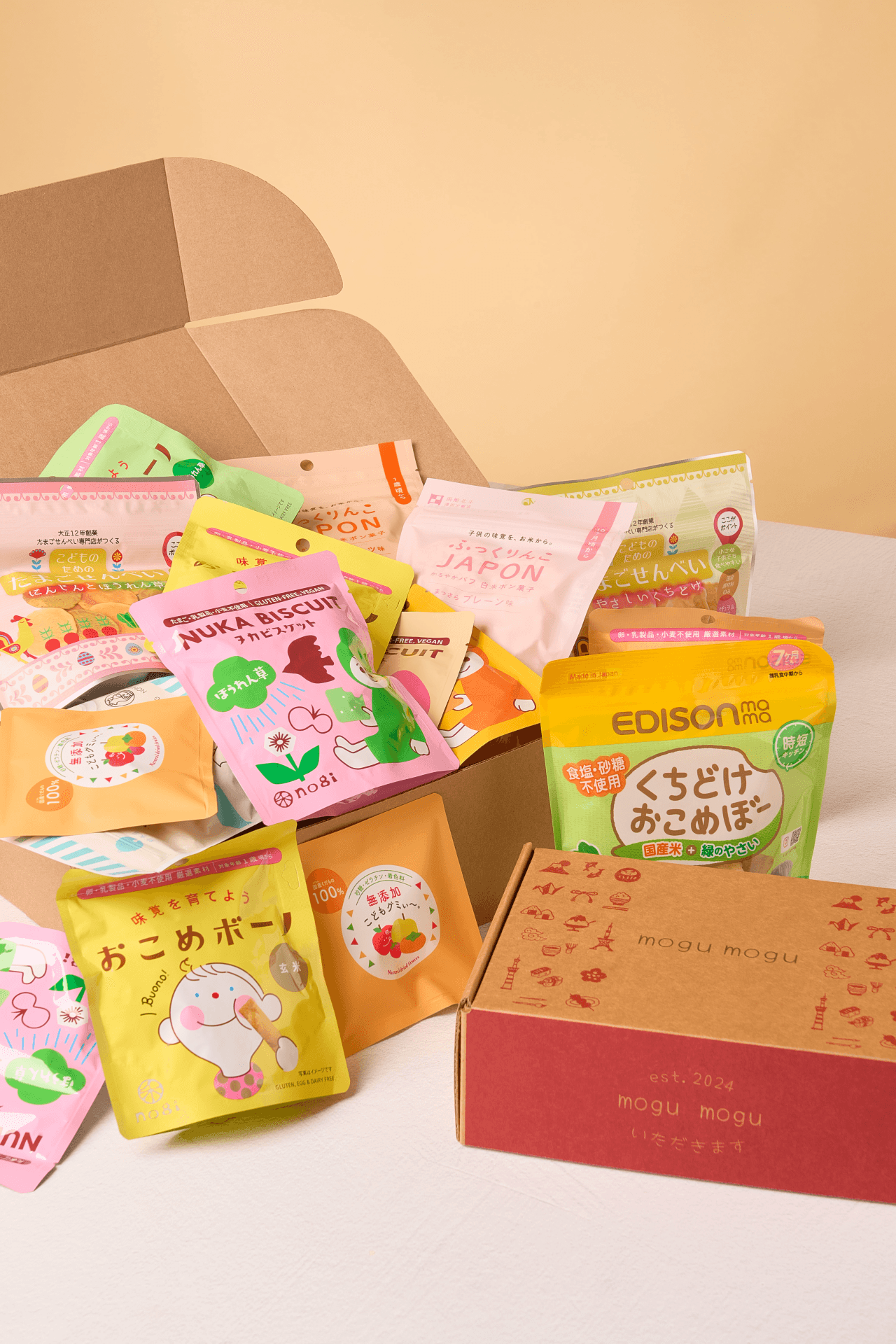
I want you to think about the last food brand you instantly recognized without reading the label. You probably knew it from the colors, the lighting, or the overall vibe. That is not accidental. That is CPG photography paired with brand consistency doing its job.
I see this all the time working with food brands. They have great products and smart teams, but the visuals feel a little scattered. Different lighting here. New props there. Suddenly, the brand looks like five different companies instead of one. Over time, that confusion chips away at trust.
So let’s talk about how to fix that and build a clear, consistent visual identity food brands can actually grow with.
Why Consistency Matters For Brand Recognition
First impressions matter, but repetition matters more. According to a study, consistent brand presentation can increase revenue by up to 33%, which applies directly to CPG photography.
When your visuals stay consistent, a few things happen.
Shoppers recognize your product faster
Your content feels more trustworthy
Marketing teams spend less time reinventing the wheel
Most food brands show up in a lot of places. Retail shelves, Amazon, paid ads, social, email, and press. If each photo feels different, brand recall drops. Brand consistency is what connects those touchpoints into one clear story.
Elements Of A Cohesive Visual Style
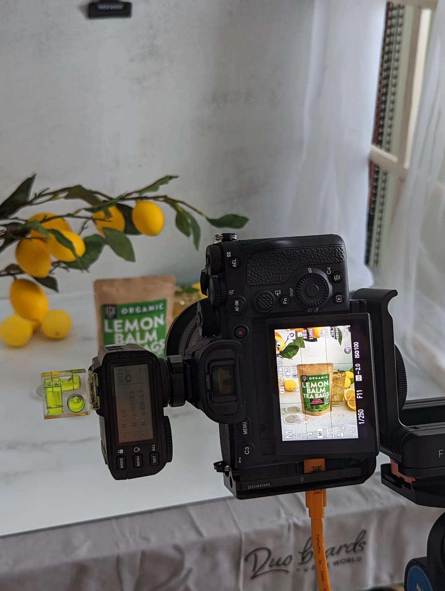
So what actually makes a visual identity feel cohesive?
I always start with these core elements:
Lighting style that stays consistent across shoots
Defined color palette for backgrounds and props
Composition rules that feel intentional
Styling that reflects how the product fits into real life
Editing choices that stay true to the brand mood
For visual identity food brands, these choices should match how the product tastes and who it’s for. A bold hot sauce should not be shot like a spa beverage.
Trends like natural light, tactile textures, and imperfect styling are big right now. But trends only work when they align with your brand story, not when they are copied blindly.
Creating Brand Photography Guidelines
This is where most brands skip a step, and it costs them later.
Brand photography guidelines do not need to be fancy; they just need to be clear. I recommend creating a simple doc that covers:
Reference images that feel on brand
Notes on lighting and mood
Do and don’t styling rules
Preferred angles and crops
Where images will be used
Think of this as your visual safety net. It keeps your CPG photography aligned even when new photographers or teams step in. It also saves money because every future shoot starts aligned.
Managing Multiple Photographers And Shoots
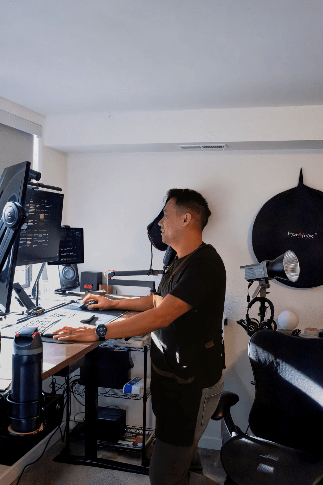
As brands grow, more hands get involved. In-house teams. Freelancers. Agencies. That’s where brand consistency can fall apart fast. My advice is simple:
Share your photography guidelines every time
Use mood boards before every shoot
Review test shots early, not at the end
Centralize feedback in one place so nothing gets lost
Consistency is less about control and more about communication. When everyone sees the same target, the work stays aligned. In fact, brands that use shared visual systems reduce production time and creative revisions significantly.
Tools For Maintaining Consistency In CPG Photography
Good systems make consistency easier to maintain. Here are a few tools I see working well for food brands:
Notion or Google Drive for brand assets
Live galleries for real-time feedback
Shot lists for every shoot, no exceptions
Social media previews to see the grid before posting
When your systems are clear, your CPG photography stays aligned without slowing you down.
Brand Case Study: Visual Identity Food Brands Done Right
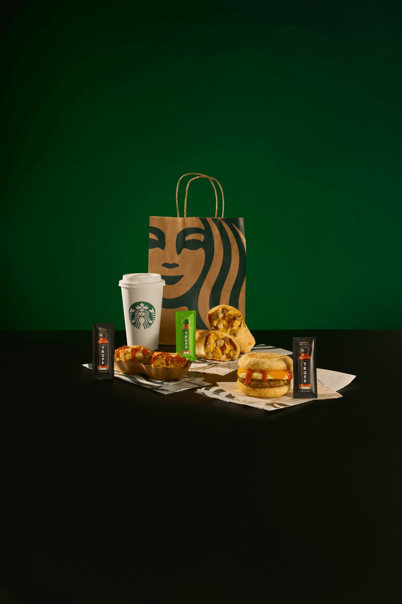
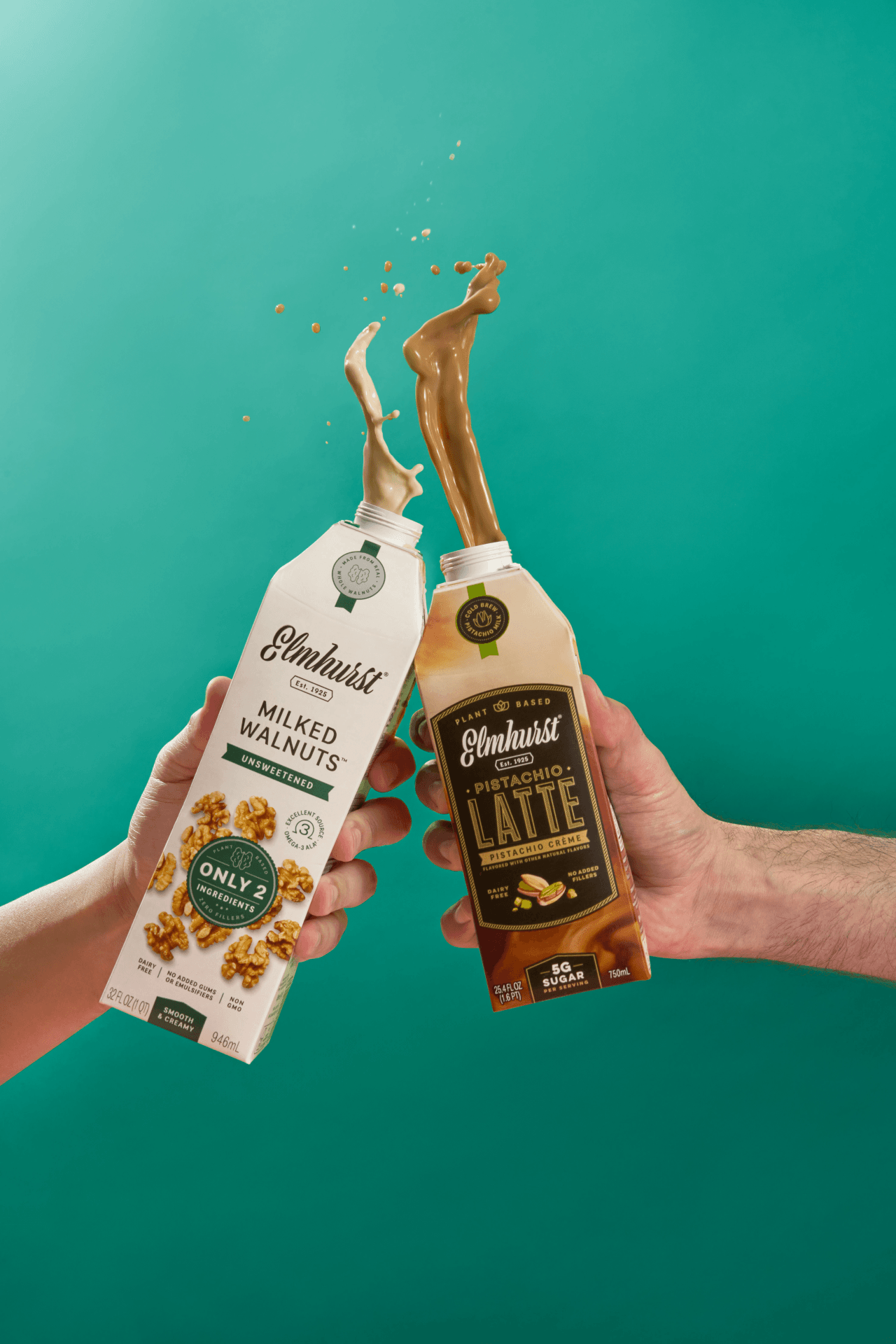
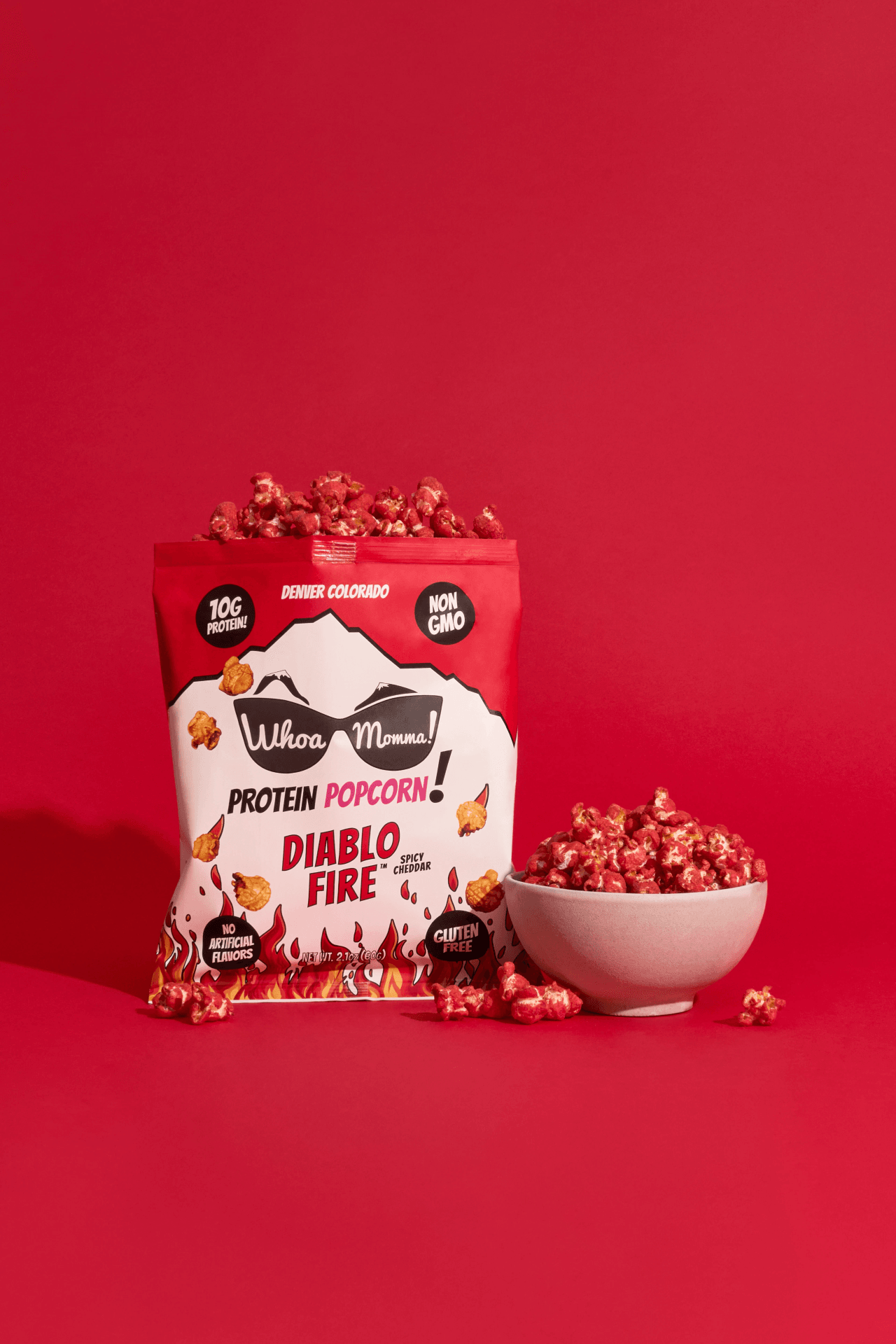
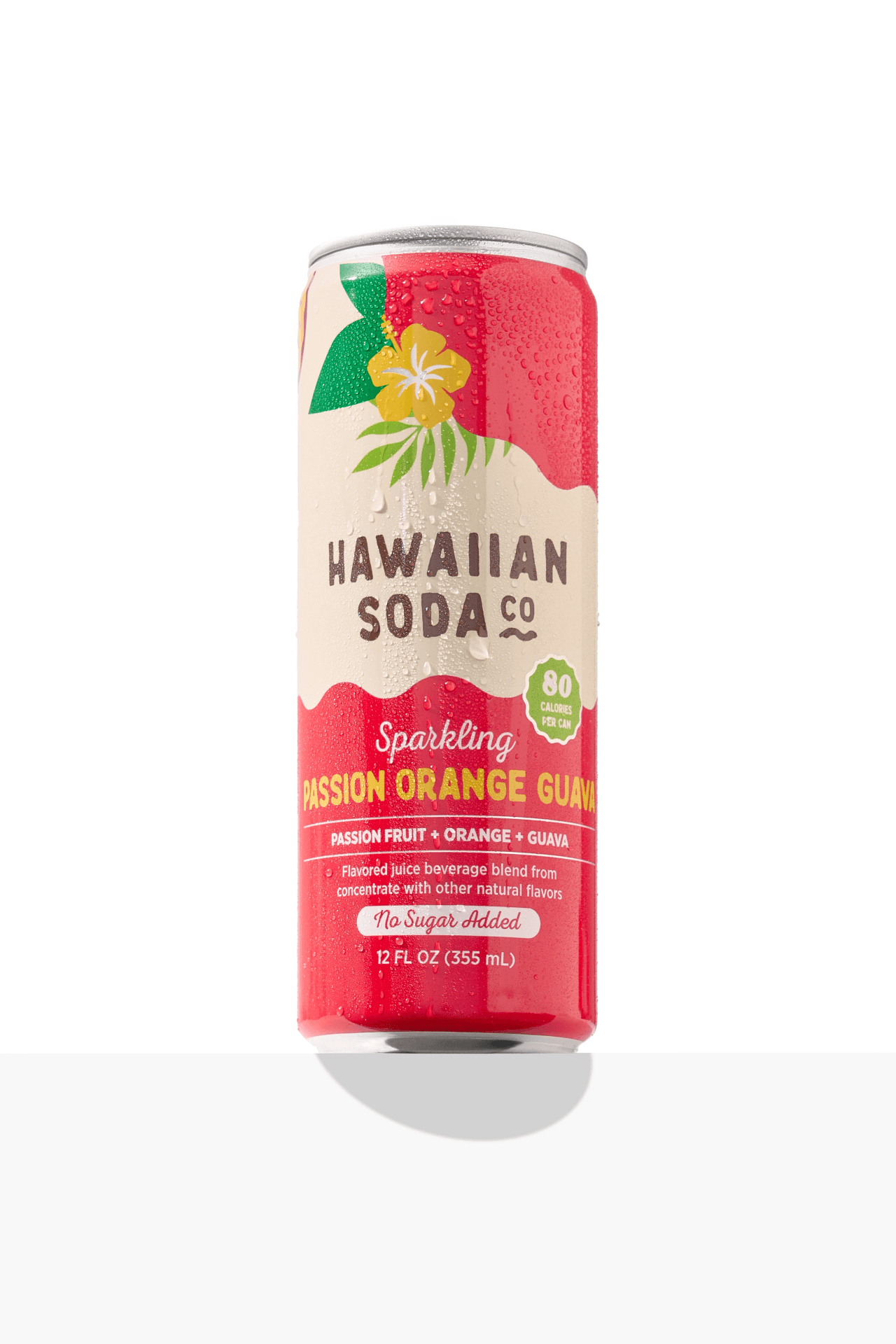
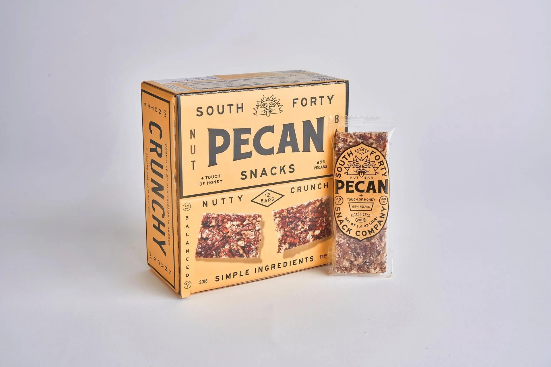
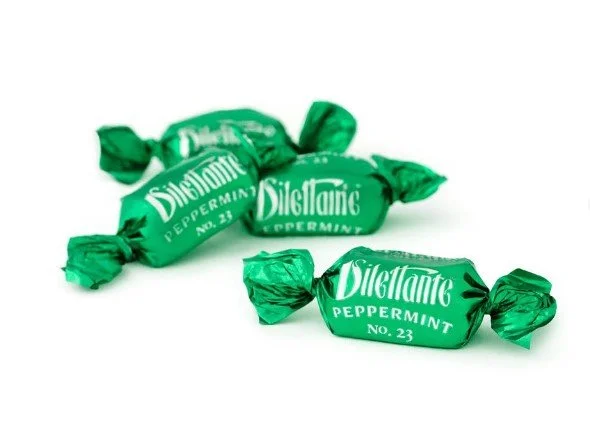
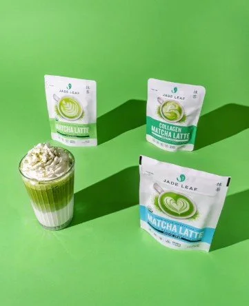
One of my favorite examples is working with established CPG food brands that refresh visuals without losing recognition. The packaging stays familiar. The lighting stays consistent. The scenes evolve, but the identity stays intact.
That’s the sweet spot. CPG photography that grows with the brand while protecting brand consistency. Every image still feels like it belongs to the same family.
Examples of Successful Campaigns

Your Visual Identity Is a Long Game, Not a One-Off Shoot
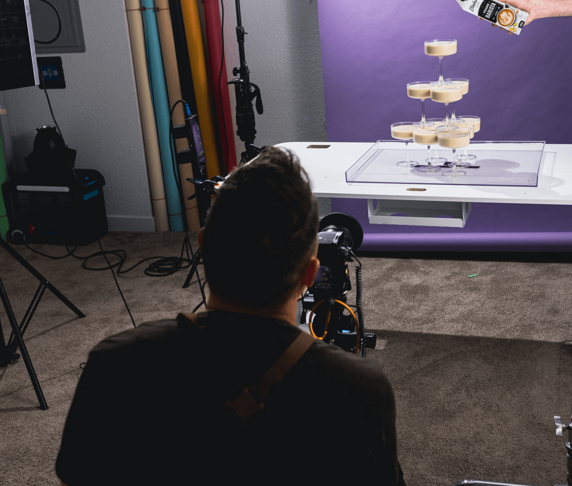
Visual identity food brands build is not about one perfect shoot, it’s about repeatable decisions made over time. When your visuals stay consistent, your brand becomes easier to recognize, easier to trust, and easier to choose. That is the power of brand consistency and a clear visual identity food brands can grow into over time.
If you’re ready to lock in your visual identity or clean up brand consistency across your content, let’s talk. I’d love to help you build a photography system that actually works for your brand.
If you want your photos to stop feeling random and start working together, let’s talk. I help food brands create consistent, scalable visuals that actually support growth.